Roxwood. Logo for an Italian horror roleplay server
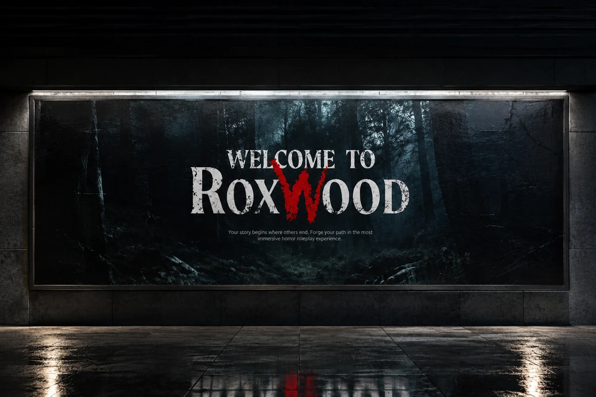
It starts with a W: blood and embers set the horror mood of Roxwood.
The project
Roxwood is a town built on ancient cursed land, and you enter it with a character and their story. Welcome to Roxwood is the Italian horror roleplay server on FiveM that is played there. The server asked for the logo to be redone, as the first step of a new brand identity.
The idea
The client had a single fixed point: the W. It had to look like blood, embers, a smouldering fire. The rest of the logo is dark and comes from the horror classics, and that W is the heart of the whole identity.
The outcome
The logo and the first idea for launching the new brand were delivered. The server developed the rest of its communication, starting from the W.