Pro Livorno Sorgenti. A crest redesign after two clubs merged
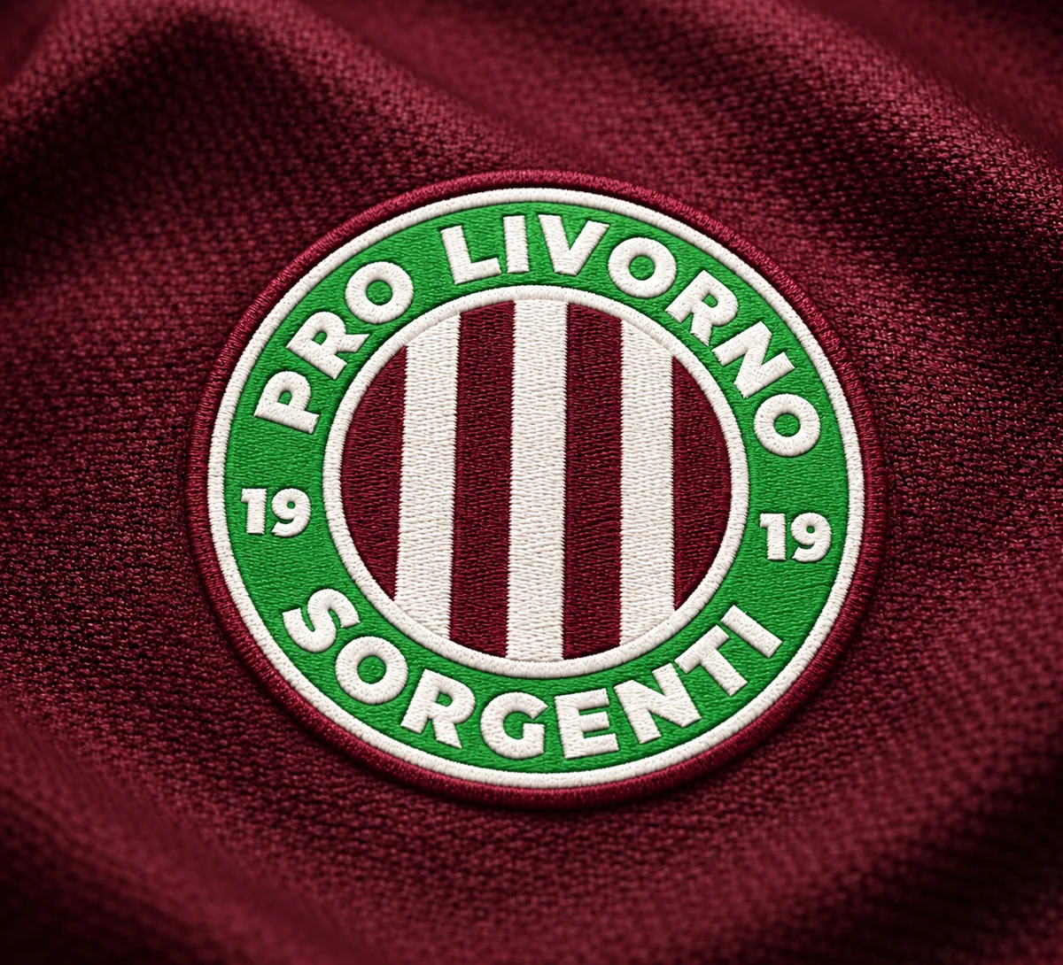
Two former crests become one, keeping the green, burgundy and symbols of both clubs.
The project
Pro Livorno and Sorgenti were two football clubs, merged long ago into a single club. The logo of the merger was the two old crests placed side by side. The club asked for everything to be renewed in a single mark, keeping Pro Livorno’s green and Sorgenti’s maroon.
The idea
The circle is the merger: a closed mark that holds both clubs inside. The vertical stripes are as many as in Pro Livorno’s old logo, and the three in the middle are the three shapes of Sorgenti’s old crest. Every piece comes from one of the two stories.
The outcome
Today the crest is on the shirts, the kit bags, the website, Facebook and the other social channels: on everything to do with the team. The logo was delivered; the club made the applications.